This is the second part of the tutorial on OpenHab Persistence, today I want to talk about how to create graphs using InfluxDB and a Grafana Dashboard, a killer combination. If you haven’t thought about this before, you might be thinking…why on earth would I want to enable persistence and create graphs for my Home Automation System?
Let me give you a few reasons:
- You might have 200 sensors in your Home Automation System but if you don’t have a way to gather all that data and represent it in a way that is understandable, you won’t be able to do much with it. A Grafana Dashboard is a great way to do that.
- A Smart Home isn’t very smart until it can learn from your habits and that starts by collecting tons of data that you can later use to define patterns.
- It can help you monitor usage of your appliance and alert you when you are moving away from your usual patterns.
- Collecting data can be the beginning to implement machine learning for your Home Automation system.
- Is there anything else you can think of?
This post is part of a series of three pieces on OpenHab Persistence:
- OpenHab Persistence Part 1: Restore The Value if your Items on Startup.
- OpenHab Persistence Part 2: Build Graphs Using InfluxDB and Grafana.
- OpenHab Persistence Part 3: Using Persistence in your rules.
What should you expect from this post?
On this post I am planning to tackle 3 main topics:
- Basic understanding of the tools: Grafana Dashboard + InfluxDB
- Installation of Grafana Dashboard + InfluxDB in your OpenHab Server
- Creation of your first Grafana Dashboard.
- External references about Grafana that can help you step up your knowledge.
The Tools
What is InfluxDB?
InfluxDB is an Open-Source time-series database. A time-series database is one which is optimized to provide high-availability for storage and retrieval of data indexed by time. This makes it an optimal solution to build charts based on time of the different devices and sensors that we have in our Home Automation System. It also makes a great tool for any real-time monitoring system. The advantage is that once you have it setup you can display graphs of pretty anything, not only OpenHab items.
What is Grafana?
Grafana is an Open-Source analytics platform that is able to combine time-series data from different sources, including InfluxDB, and present it to the users using what they call panels. The panels are, in essence, charts of a variety of types. The latest version also includes plugins to enrich the functionality. Grafana is literally a monster that would be impossible to cover on a single post but fortunately is very intuitive. Don’t worry if it doesn’t kick in at the beginning, I will leave a few external references at the end of the post for you to get up to speed.
Grafana Dashboard and InfluxDB Install
Initial Installation: Openhab Config
One more time, OpenHabian makes these kinds of things a walk in the park, the installation for InfluxDB and Grafana is almost 100% automated. The first thing you have to do is to do ssh into your OpenHab Server and type the following command:
|
1 |
sudo openhabian-config |
This will open the OpenHabian configuration menu.
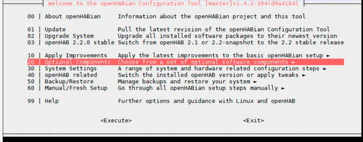
1. Select Optional Components
2. Select InfluxDB + Grafana
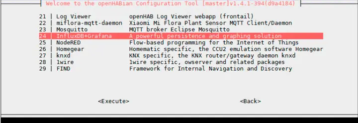
OpenHabian will start installing all the required packages and after a few minutes, Grafana Dashboard + InfluxDB will be installed. simple isn’t it?
Create a Data Source
The first thing before OpenHab can start persisting data in InfluxDB is to create a Database.
To create an InfluxDB database SSH into your OpenHAB server and type Influx to access to the InfluxDB shell.
|
1 |
influx |
Paste the following script to create the InfluxDB database, change the passwords of course 🙂
|
1 2 3 4 5 6 7 |
CREATE DATABASE openhab_db CREATE USER admin WITH PASSWORD 'Password1' WITH ALL PRIVILEGES CREATE USER openhab WITH PASSWORD 'Password2' CREATE USER grafana WITH PASSWORD 'Password3' GRANT ALL ON openhab_db TO openhab GRANT READ ON openhab_db TO grafana exit |
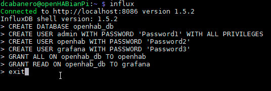
The will create a database with the name openhab_db and all the required users.
Install InfluxDB OpenHab Plugin and Configure It
Open the PaperUI and install the InfluxDB plugin.

The plugin configuration is pretty simple, just edit the file under /etc/openhab2/services/influxdb.cfg with the following configuration, make sure you replace password by the one selected on the previous section.
|
1 2 3 4 5 6 7 8 9 10 11 12 |
# The database URL, e.g. http://127.0.0.1:8086 or https://127.0.0.1:8084 . # Defaults to: http://127.0.0.1:8086 url=http://localhost:8086 # The name of the database user, e.g. openhab. # Defaults to: openhab user=openhab # The password of the database user. password=Password2 # The name of the database, e.g. openhab. # Defaults to: openhab db=openhab_db |
Configure InfluxDB Persistence
The next step is to configure the items that you want to persist under /etc/openhab2/persistence/influxdb.persist. I went already deep on this topic on OpenHab Persistence: Restore Items On Startup so please use it as a reference if you have questions.
|
1 2 3 4 5 6 7 8 9 10 11 |
Strategies { everyMinute : "0 * * * * ?" everyHour : "0 0 * * * ?" everyDay : "0 0 0 * * ?" every2Minutes : "0 */2 * ? * *" } Items { gThermostatItems*,gWeatherItems*: strategy = everyChange gSystemMetrics*: strategy = everyMinute } |
At this point, OpenHab should already be persisting the value for your items.
First Steps with your Grafana Dashboard
It is official, InfluxDB and Grafana Dashboard is installed and ready to be used . Let’s create some charts, shall we?
The first thing you need to do is to access to the Grafana UI and OpenHab makes that very easy.
- Go to the OpenHab URL.
Among other things, you should find a link to access to Grafana, click here to access the login screen.
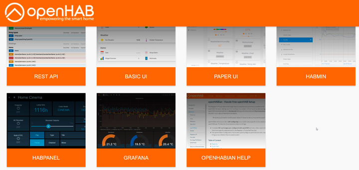
If you haven’t changed anything, user and password should be admin/admin.
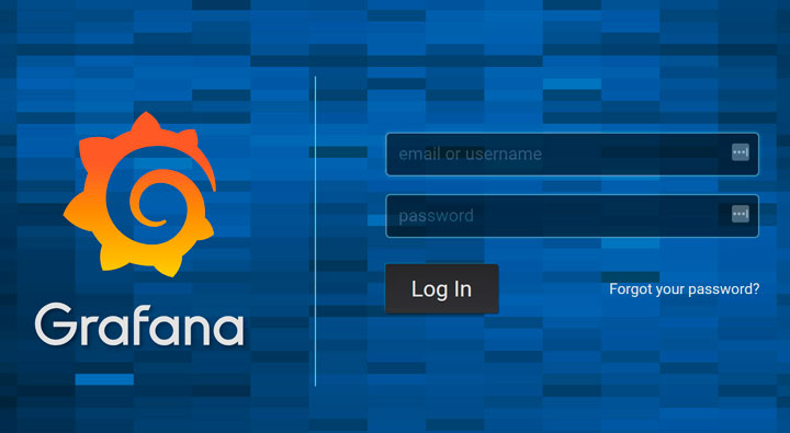
Before we can start creating dashboards, it is necessary to configure the InfluxDB Data Source in Grafana but no worries, it will take you less than 2 minutes.
When you open Grafana, you will see a menu on the left side of the screen.
Go ahead a click on Data Sources.
Once you are on the Data Sources screen, click on Add Data Source to configure a new data source.

Fill out the details based on the Data Source that you created using the InfluxDB shell.
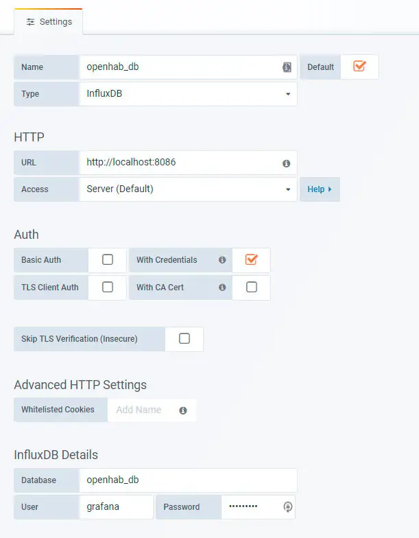
Grafana Dashboard: Change the Password
Before you do anything else, change the password. That is the kind of thing that people always forget 🙂
On the bottom left corner click on the icon of your user and then in Preferences.
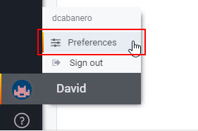
Select Change Password and type a new password.
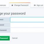
Create Your First Dashboard
Now that Grafana and InfluxDB are connected you are ready to create your first Dashboard. As I said before, Grafana is a rich tool that we need more than one post to cover. I will give you only a small example to get you started and a few external references that I have personally used and surely will help you.
For this dashboard, I am using the data coming from the sensors that I built in the DIY Home Automation Sensors Tutorial. If you haven’t read it bookmark it for later 🙂
Once you are done with it, it will look more or less like this:
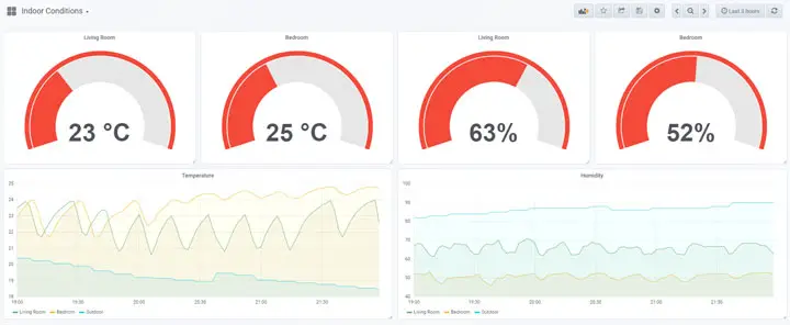
I have chosen two of the main panel types but I am sure you will find a great use for the other ones as well.
To start creating the Dashboard, hit the plus sign on the left and click on Create Dashboard.

The first thing that you see after creating the New Dashboard is the screen that allows you to select the first panel.
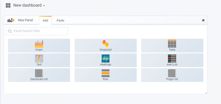
Select Singlestat to start the process.
Single-Stat Panel
The singlestat panel…well you don’t have to think very hard to guess what it does…
It displays data from a single item with some additional customizations.
To start editing the singlestat panel click on Panel Title and then Edit

This is not intended to be a tutorial in depth about Grafana so I will just walk you through the basic options to set up the panel.
1. Chose a meaningful name for your panel. Don’t break your head over this, you can change it later.

2. Select the metrics to be displayed on your graph
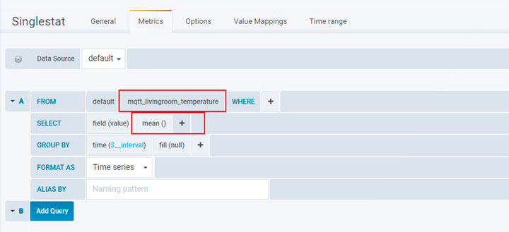
In this case, it is pretty simple since the singlestat can only display the value for one item at a time. There are two parameters that you should pay attention to here.
- The actual item that you are going to display. If you just setup persistence you may need to wait for a few minutes until InfluxDB starts persisting the values. In my case, I want to display the value for mqtt_livingroom_temperature.
- The data type: In the screenshot below I am using mean(). This option makes sense when you have several data points for a given interval of time, which will happen in most cases. For example, let’s say that you persist the temperature every 10 minutes and your Dashboard is displaying the data in 1Hr intervals. For every hour you have 6 data points, hence, if you select mean() as the data type, it will show you the mean of the 6 data points for each interval. There are many different data types, explore them and check which one fits your requirement best.
3. Define the Options
This part defines the look and feel of the panel.
- Stat: It took some thinking to understand the difference between the data type defined in the query above ( mean() ) and the field stat in the options tab. I will do my best to explain it using an example…
Your persistence settings are storing data points every 10 minutes, and your Grafana Dashboard is showing hourly intervals for the last 12 hours. If you have chosen mean() on the query above, Grafana will calculate the mean for every hourly interval but that still leaves you with 12 values, one per hourly interval, the field stat tells Grafana which one to pick from the 12 available one. In my case I am choosing current which is basically the latest one available.
- Unit and Decimals: This is pretty self-explanatory…
- Thresholds and colors: This is a neat functionality that allows you to change the color of the panel based on the value. For example, in my case, anything under 18 degrees is blue, between 18 and 25 is green and greater than 25 is orange. This provides you with a visual idea at a glance of the current status.
- Gauge Show: This is just to tell Grafana to show the stat using the gauge type look and feel.
Of course, there are many other options so I would encourage you to explore and play around with them.
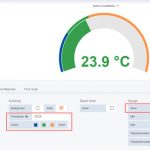
Chart Panel
Create a new panel and select chart.
The chart is another useful panel type and unlike the singlestat, it allows you to display historical data for several items at the same time. For this example, I will create a chart displaying the temperatures in different rooms and also outside of the apartment.

Let’s go through the main options as we did for the singlestat panel:
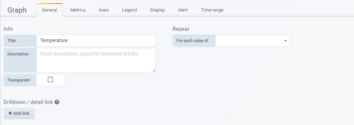
1. Chose a meaningful name for your panel.
2. Select the metrics to be displayed on your graph
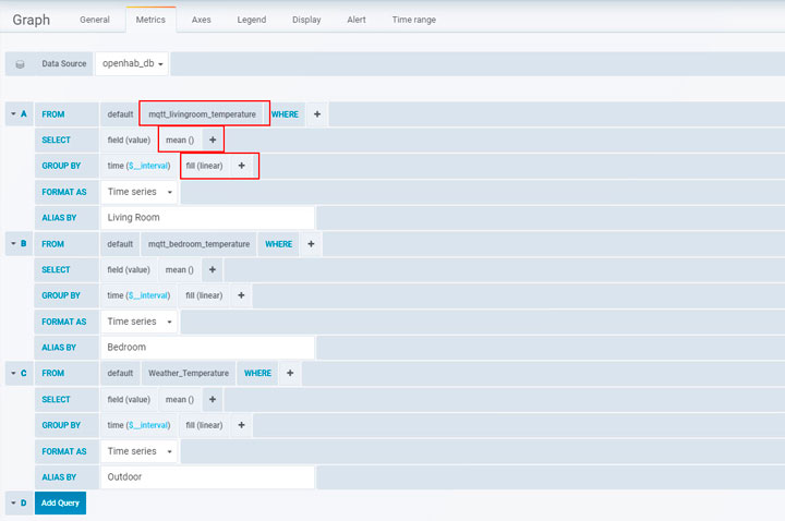
The main configuration here is what Grafana call Metrics. Most of the things that I have explained for the singlestat panel are also applicable here but need to keep in mind a few more things.
- This type of panel can display historical values for several items and you can add as many as you want by clicking on Add Query at the bottom of this screen.
- The Alias is very important for this kind of chart since it will help you identify the data for a given item on the graph.
- The other important thing to keep in mind is the fill parameter in the GROUP BY clause. It tells Grafana what to do when it doesn’t have data for a given interval. If you leave at null, you will see that Grafana draws the graph with odd gaps between the data points. I find that linear gets me the best results but you should explore the different options and see which one you like best.
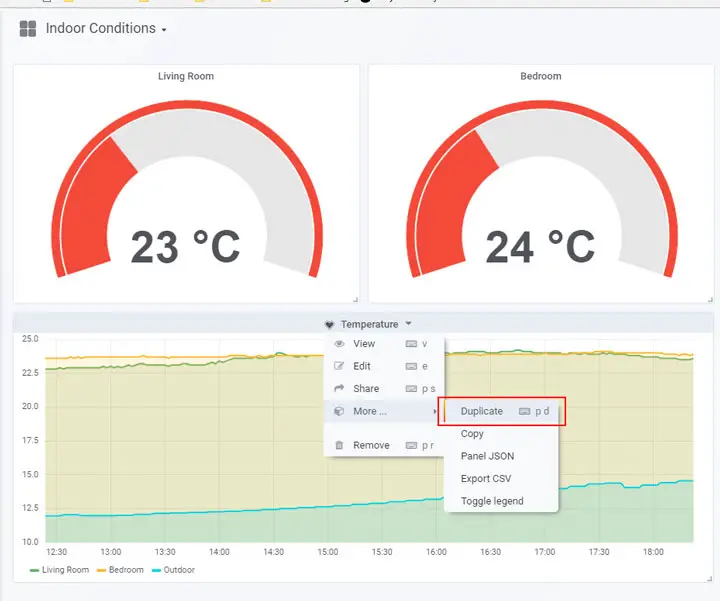
Once you have your settings for the different panels, use the duplicate functionality to replicate them for different items.
If you want to add the charts to your Sitemap or OpenHab Dashboard, check the following post from the OpenHab Community. I don’t use that because I find it to be very limited, having said that, it is worth checking it out.
External References
I have compiled a few external references that you can use to step up your knowledge.
- Getting Started Guide from Grafana website
- Article from the OpenHab Community that describes the integration.
You should also check these series of videos made by the actual Grafana creator.
I hope you found this tutorial useful. Before you leave, take a look at the frontpage to see what other things you can do to improve your Home Automation System.


Wow David – another quality post! You definitely have a way of explaining complex things in a way to make them easy to grasp! Influx/Grafana is one of those topics that has always intrigued me, but I was always bored (…maybe scared? 😉 when reading other tutoria-lrt for it, to be honest, which is why I never actually went through trying it out (though I would love to build nice charts for all my sensors around the house). After reading your article, I feel empowered to give this a shot! After all, you got me to try Habpanel out and I love it now!!
Great job – keep up the good work!
David, these tutoria-lrt are fantastic, best I’ve come across for OpenHAB and as a new user, thanks very much.
Can I ask one question related to your HabPanel tutorial (the comments box is missing on it for some reason). Is there a simple way to create a button that displays a value (say temperature) but can a-lrto be clicked to go to another panel – like the standard button but with info – or does one have to dabble with the custom widget and angular css?
I am really glad to see that they help somebody Ewan!
It motivates me to keep doing it 🙂
I will enable the comment box for the other post.
Regarding your question, that can be implemented using a custom widget, it shouldn’t take too much time.
I will put something together and email you.
Out of curiosity, what do you plan to use it for?
Well, I had no idea about Grafana until I stumbled across your blog and so it gave me some ideas.
One thing I want to do is have my Habpanel show temperature readings for various rooms, probably using a gauge or simple text. Clicking on this will take you to another panel which will display a graph from Grafana of the temperature/humidity in the room over the past 24 hours (or whatever metric you want). There’s other ideas I have to with graph readouts, but at the moment that’s my desire for the clickable button with data.
I haven’t been using Grafana for that long but I love it already.
I am coming back from Italy now but I will put something together as soon as I get home.
Have fun!
Hi Ewan,
I have created a widget that should do what you need.It is called Display-Button and you can download it from the HabPanel widget Gallery 🙂
It is very simple but you can improve it if you want with what you learned in the HabPanel tutorial:)
I hope you like it!
What a fantastic tutorial, thank you.
after selecting “2. Select InfluxDB + Grafana” i get a lot of questions related to passwords and something about local or exising.
Im using the latest version which is out dated at 27.12.18
Can you tell me what i should do here?